Use Inspired fruit colors when choosing:
Paint colors for interiors Wall colors and curtains Fabric combinations Home accessories like throws and pillows Color combinations for bedding Website colors Social media posts
Personally, when designing either interiors or graphics, I always have three colors. I use one color as the majority color. As an example, I would pick one paint color for my walls; I would use it up to 80% of the entire design. The remaining 15% is for my chosen secondary color; I would use that for my fabrics like curtains, bedding, or upholstery. The remaining 5% I use as an accent color like throw pillows, accessories, paintings, and so on; that usually gives me a good enough ratio to carry my design or color choices across. It does not matter if you choose the lighter or darker color as the base; that would depend on the mood and look you are going for. It does simplify my method as I can target the areas I want to paint with particular colors or buy furniture with a specific color fabric and so on. This method might differ from one designer to the next, but for me, it has proven to be quite useful.
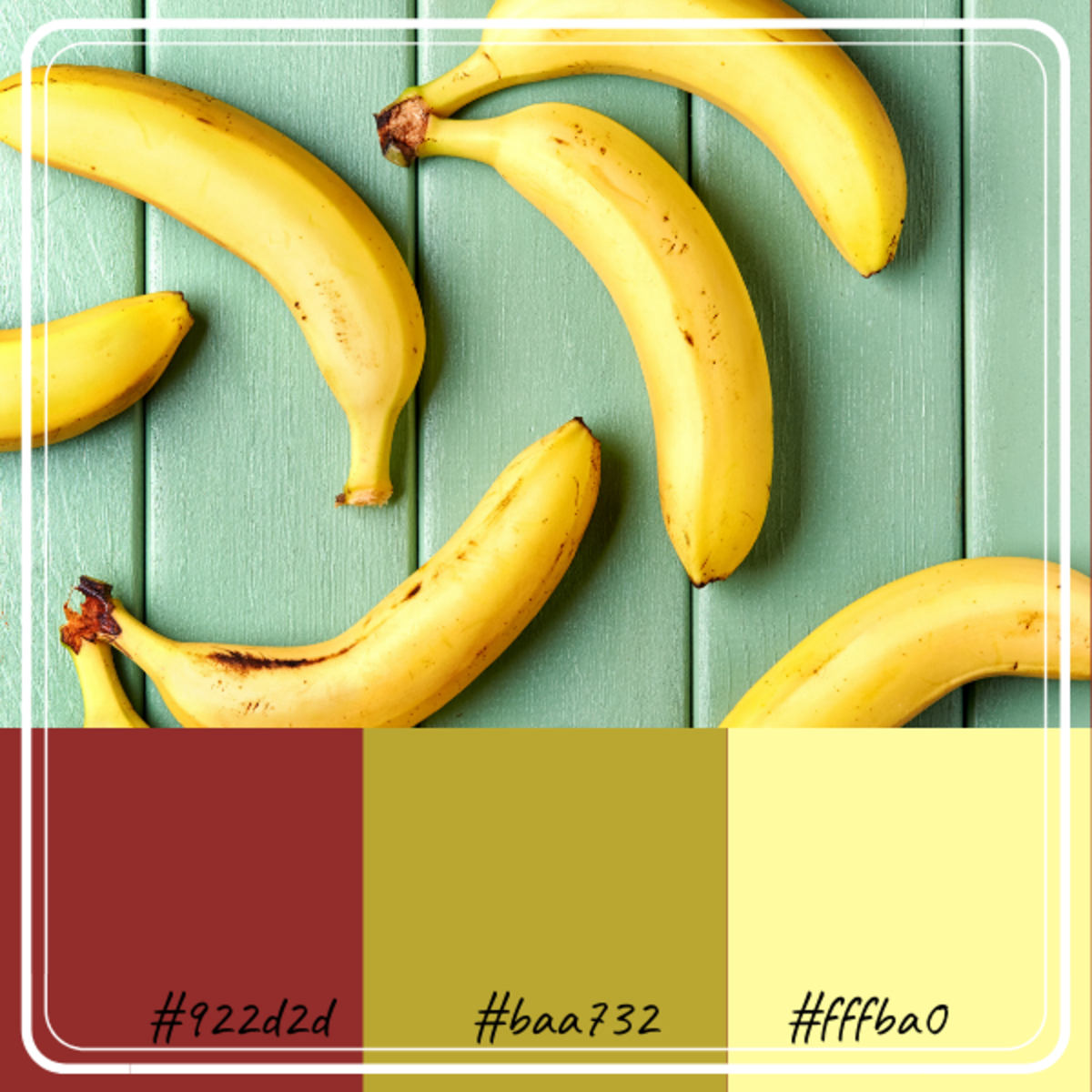
Banana-Inspired Color Combination
The colors of a banana is an instant mood lifter. Whenever I see a banana I think of the tropics. Maybe a warm and breezy day looking at rows of banana trees, driving along a rural road. The banana has several colors that really go well together when translated into paint. This color combination is very earthy, combining yellows, buff, green, and reds/browns. These colors are very soothing. You can use these colors with my method of 80% base, 15 % a secondary color, and 5% accent color.
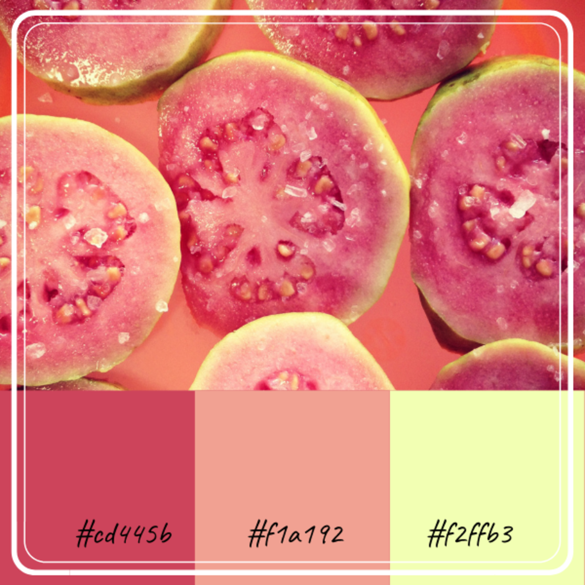
Guava-Inspired Color Combination
The guava is an exotic and attractive tropical fruit. Its colors are rich, and the combination is gorgeous. It has lots of shades of red, pink, maroon combined with green and yellow. It is trendy among young girls. A lot of Instagram posts are saturated with guava colors, and there is a good reason for it since this color is very youthful and fun.
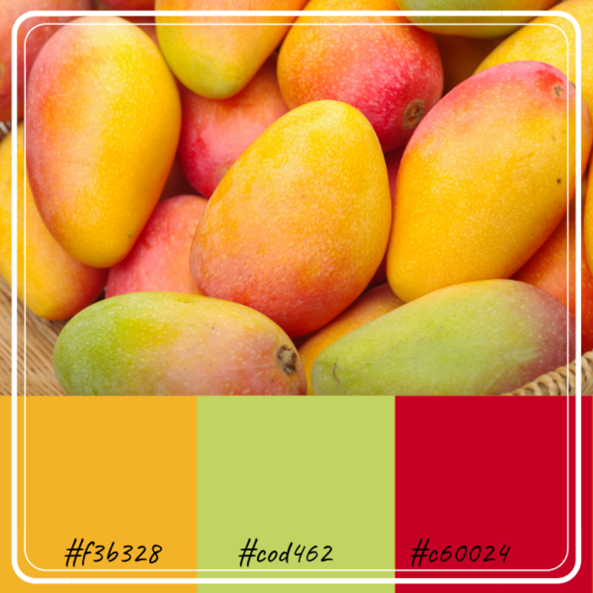
Mango-Inspired Color Combination
The mango has a lot of warm colors like reds, bright yellow, and orange. This screams personality. If you want to make a color statement, this would be it. It is bright and loud and fun. Just like the mango, it has a flavor all its own.
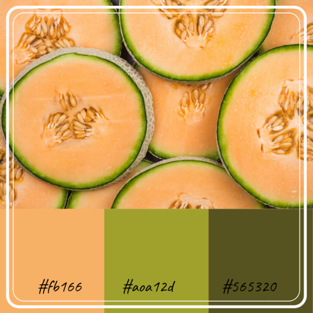
Melon-Inspired Color Combination
The melon color combination is a bit more subdued. It has a very earthy and easy-going feel. When translated into interior paint, the peachy melon color will work well with the 80% coverage—the greens as the secondary and accent colors.
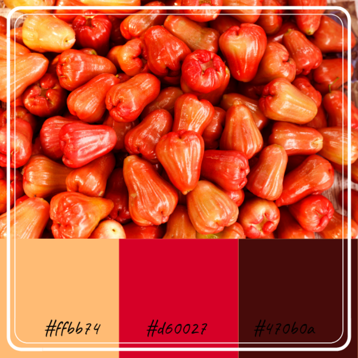
Rose or Wax Apple-Inspired Color Combination
This is the Rose or Wax Apple. It is a sweet, bell-shaped, delicious fruit with a cottony center and seed/s in its core. This is a beautiful fruit since its skin can have several shades of red, orange, pink/ magenta. Combining orange, magenta, and brown makes this color palette feel very sophisticated. It has deep tones and is very dramatic.
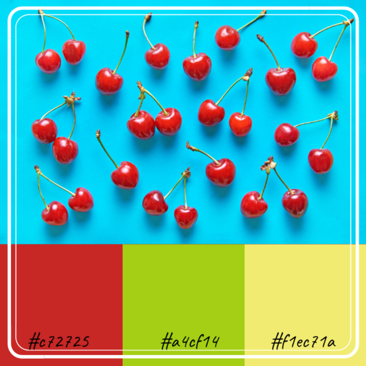
Cherry-Inspired Color Combination
The cherry inspired color combination is very bright and tart. This is an excellent color palette for choosing accessories or decorations. To brighten up a room, I suggest a tapestry or painting using these colors. It will surely brighten up your mood.
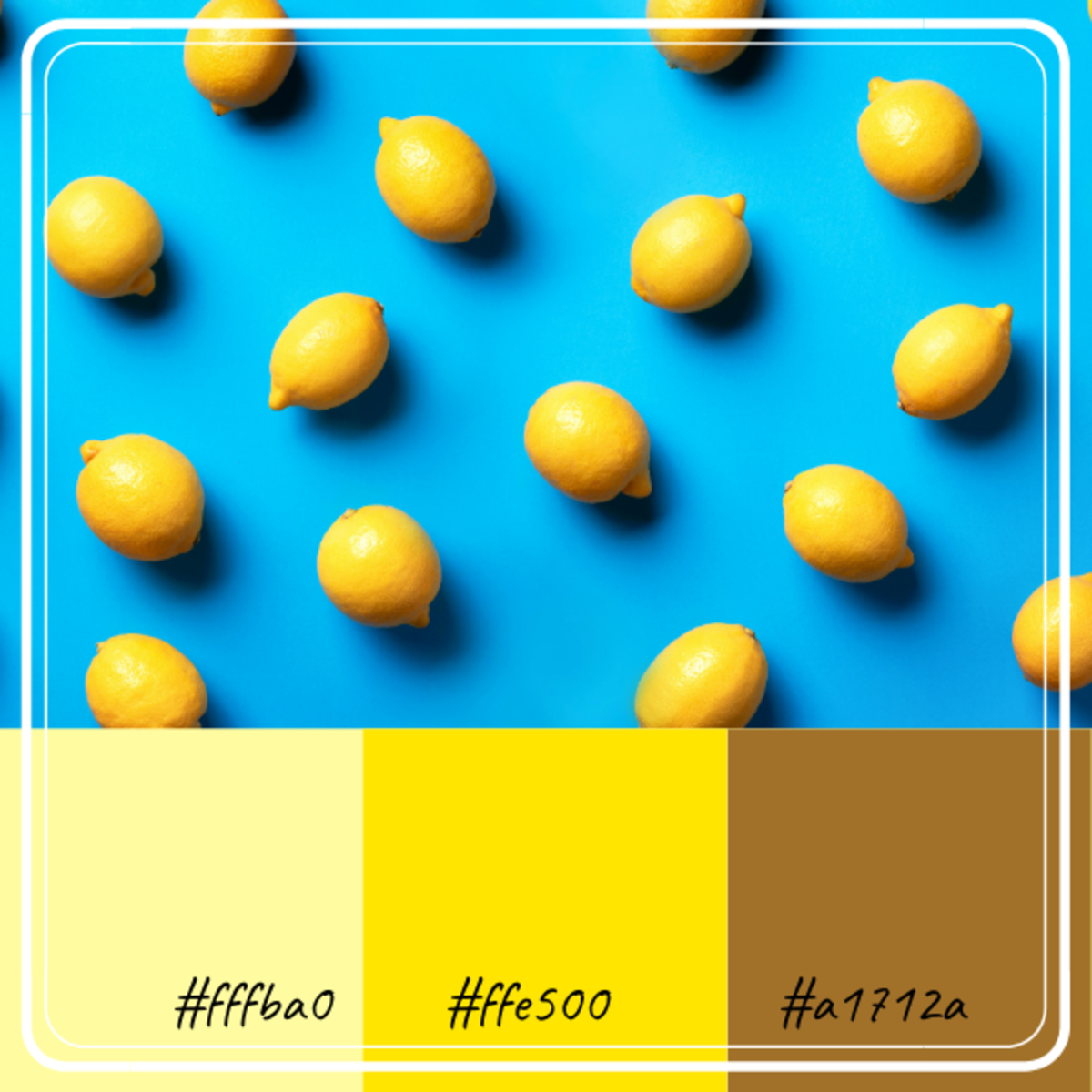
Lemon-Inspired Color Combination
If you are thinking of a bright, sunny, colorful summer palette, look no more, your inspiration is the lemon! Who doesn’t love all that yellow? By combining it with a bit of brown, and lighter shade of yellow it takes it down just a notch but still packs a punch.
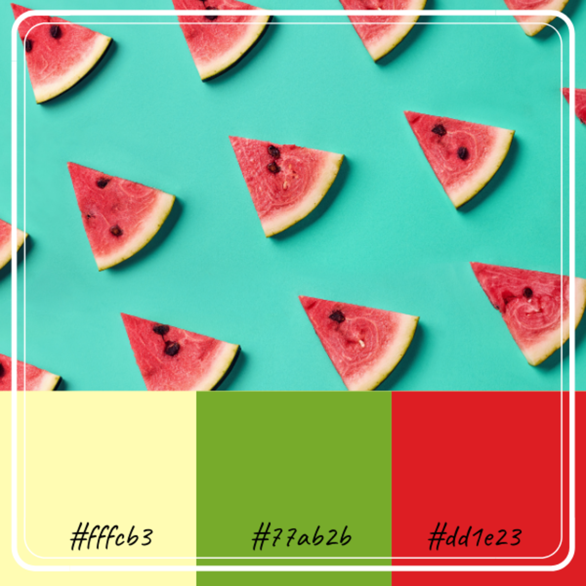
Watermelon-Inspired Color Combination
There is nothing more refreshing than this color palette; it is also very popular on social media because it is so bright and stimulating. By combining the red, green, and light yellow, you will be able to use this combination over and over again without it feeling old.
Pineapple-Inspired Color Combination
The pineapple has gained a lot of steam lately. There are numerous pineapple patterns and pineapple accessories being produced. This is a nice pineapple inspired palette to go with the pineapple accessories you might have or is planning on getting.
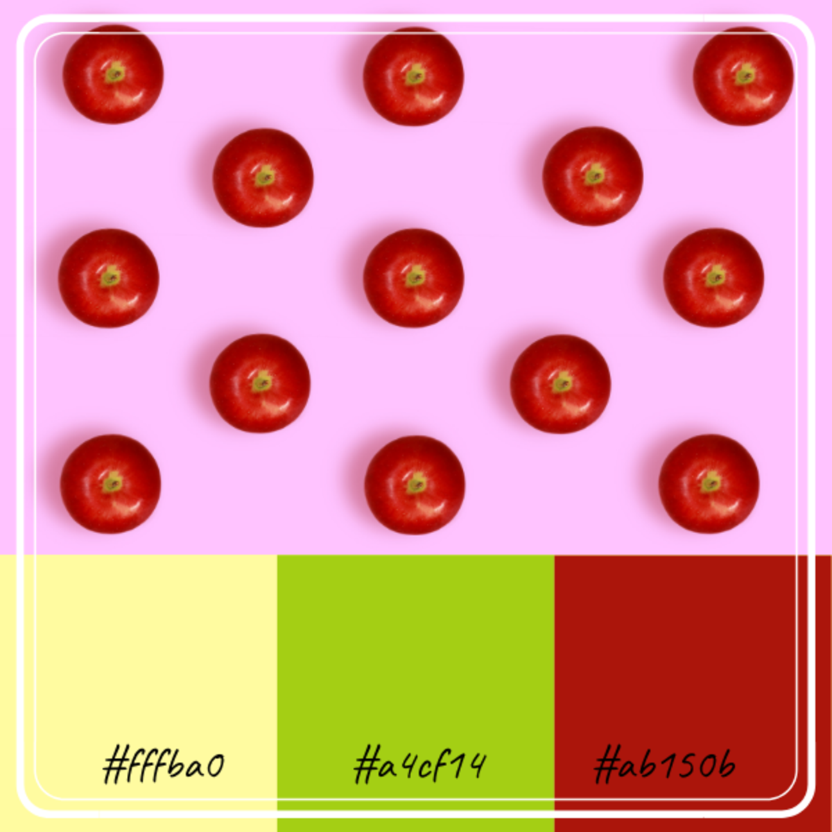
Apple-Inspired Color Combination
The apple is a very classic fruit and deserves a classic color combination, So, to represent the apple, let’s go with red, green and let us add a bit of light yellow to tie it together.
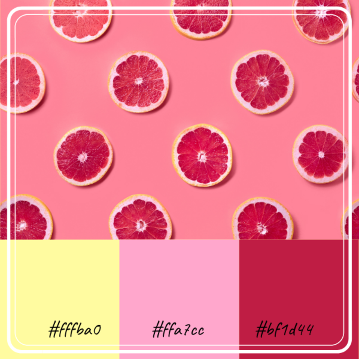
Grapefruit-Inspired Color Combination
The grapefruit color palette is another very young and vibrant color combination. By grouping pink, red, and yellow, you come up with a citrusy blend that can be used in different applications.
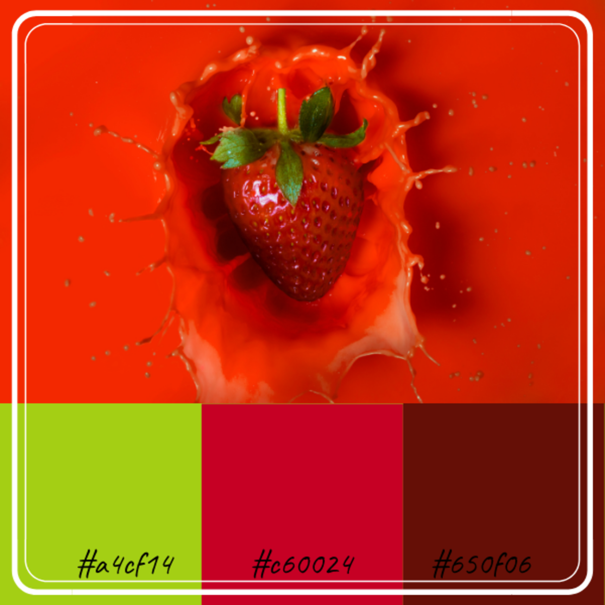
Strawberry-Inspired Color Combination
The colors of the strawberry inspired palette is deep and rich. If this combination is used for a room color, you can expect a lot of drama. The strawberry’s colors are also quite popular. This combination includes red, green, and maroon.
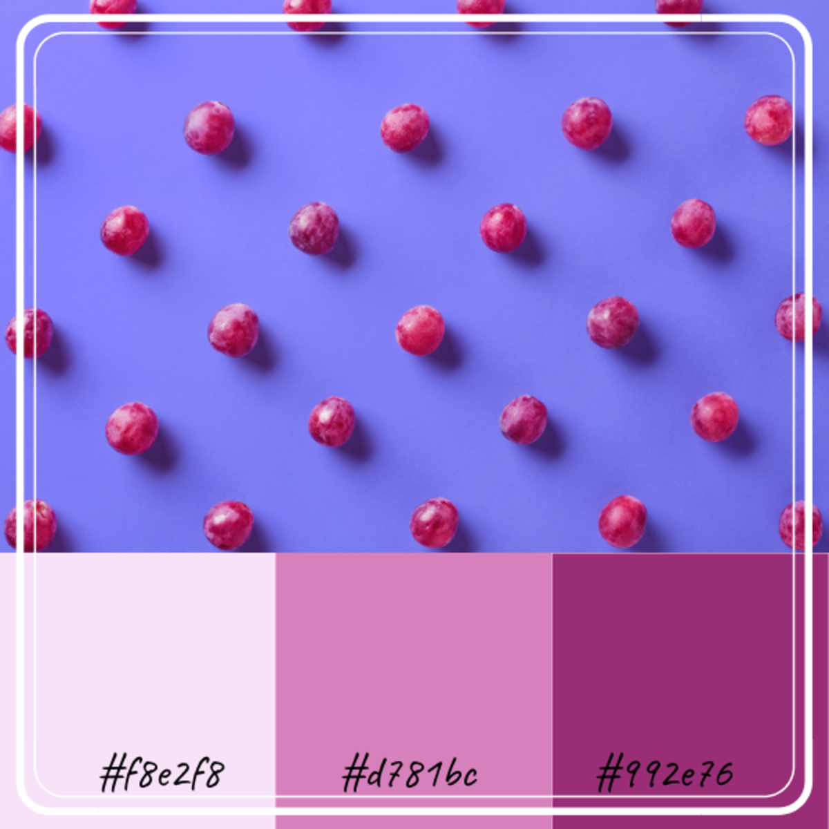
The Grape-Inspired Color Combination
Whether you think of wine or berries or jam, the grape inspired color palette is understated and very mellow and soothing. © 2020 Anna Javier
